The Hidden Revenue in Your Checkout Process
Your checkout process isn’t just the final step; it’s a critical point where you can win or lose revenue. In fact, it’s often a source of unnoticed losses due to checkout friction: those small obstacles that quietly drive customers away. This untapped revenue represents a significant growth opportunity, especially when the average cart abandonment rate is around 70%.
The Cost of Checkout Friction
This high abandonment rate equals significant lost sales. Imagine recovering even a small portion of those abandoned carts. For example, if your store makes $100,000 in monthly revenue, a 70% abandonment rate means you’re missing out on a potential $70,000. Even a small improvement, like a 5% reduction in abandonment, could mean an extra $3,500 per month. This highlights how optimizing your checkout is as important, if not more so, than attracting new customers. You might be interested in: How to master ecommerce SEO.
Ecommerce checkout optimization is increasingly important for conversion rates and customer satisfaction. For example, UK retailer White Stuff achieved a 37% increase in conversions and a 26% increase in average order value after implementing a one-page checkout. This also led to a 100% speed boost on mobile, demonstrating the positive impact of a streamlined checkout experience. Find more statistics here: Ecommerce Checkout Optimization.
Identifying the Leaks
So, what causes checkout friction? Often, it’s a combination of seemingly minor issues:
- Complicated Navigation: A confusing checkout process can quickly frustrate customers.
- Excessive Form Fields: Requesting too much information can be overwhelming.
- Lack of Trust Signals: Missing security badges or unclear return policies can reduce customer confidence.
- Limited Payment Options: Not providing preferred payment methods can lead to cart abandonment.
- Poor Mobile Optimization: A difficult mobile checkout experience can discourage smartphone users.
Turning Friction Into Flow
Fixing these problems can generate a significant return on investment. Optimizing the checkout process is vital for increasing revenue; options like Shopify checkout customization can significantly impact conversions. By simplifying the process, building trust, and offering flexible options, you can turn a loss-generating checkout into a revenue-generating machine. This means designing a seamless and positive experience that encourages customers to complete their purchases.
Streamlining Your Checkout: Less Steps, More Sales
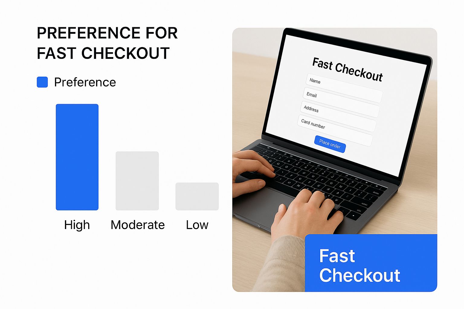
This infographic shows a customer easily checking out on their laptop, highlighting the “Fast Checkout” experience. It emphasizes the speed and simplicity of the process, showing the benefits of a streamlined checkout. This visual reminds us how important a smooth checkout is for encouraging sales. For more on improving your Shopify store, check out this article: How to master Shopify Conversion Rate Optimization.
Reducing Friction for Higher Conversions
Checkout complexity is a major reason why people abandon their online shopping carts. Every extra step and field adds friction, making it more likely a customer will give up on their purchase. This has a direct impact on your profits. Imagine your checkout process is like a leaky funnel – the more complex it is, the more potential revenue you lose.
The Impact of Form Fields
Studies consistently show a link between the number of form fields and conversion rates. The more fields, the lower the conversions. Baymard Institute‘s research reveals the average checkout has 11.3 form fields, while best practice recommends just 8 essential fields. This seemingly small difference can significantly affect your sales. Hiding optional fields like “Address Line 2” and “Coupon Code” behind links can also declutter the page and make it feel less demanding.
One-Page vs. Multi-Page Checkouts
Choosing between a one-page or multi-page checkout really depends on your business. For simple purchases with few items, a one-page checkout is often very effective. It streamlines the process and minimizes clicks. But for complex orders with many products, customizations, or add-ons, a multi-page checkout can be a better choice. It provides a clearer, less overwhelming experience, allowing customers to focus on one section at a time. This reduces their mental effort and improves completion rates.
Optimizing for Mobile
Mobile ecommerce checkout optimization is essential. A checkout designed for desktops often becomes difficult to use on smaller screens. Make sure your mobile checkout is easy to use with a thumb, with large input fields and minimal scrolling. Offering mobile-specific payment options like Apple Pay and Google Pay also reduces friction. These improvements can greatly enhance the mobile user experience and boost conversions on smartphones and tablets.
Let’s look at how different checkout approaches affect conversion rates:
Checkout Length Comparison: Impact on Conversion Rates
This table compares different checkout approaches and their impact on key performance metrics
| Checkout Type | Average Conversion Rate | Mobile Performance Impact | Implementation Complexity | Best For |
|---|---|---|---|---|
| One-Page | Higher for simple purchases | Can be cumbersome if not optimized | Easier | Simple products, few items |
| Multi-Page | Higher for complex purchases | Easier to optimize for mobile | More complex | Complex products, many items, customizations |
Key takeaway: The best checkout type depends on your product and target audience. Simple checkouts are great for simple purchases, while multi-page checkouts are better for complex purchases. Always optimize for mobile to maximize conversions.
Building Trust That Transforms Hesitation Into Action
Customer hesitation at checkout often comes down to one key factor: trust. It’s not necessarily about doubting the products themselves, but more about the perceived security of the checkout process. For successful ecommerce checkout optimization, addressing these concerns is paramount.
Security Signals That Soothe Anxiety
Imagine your checkout process as a bridge connecting your customer to their purchase. The foundation of that bridge? Trust. Displaying prominent trust signals throughout can significantly reduce those frustrating abandonment rates. These signals serve as reassuring cues, indicating a secure and reliable transaction.
- SSL Certificates and Security Badges: These are absolutely essential. Customers expect visual reassurance like the padlock icon and badges from recognized security providers.
- Clearly Displayed Contact Information: Provide easy access to your contact information. This transparency builds confidence by letting customers know they can reach out with questions.
- Third-Party Payment Gateway Integration: Integrating trusted payment gateways like PayPal or Stripe adds another layer of security and uses familiar platforms for customers.
Transparency Builds Confidence
Building trust extends beyond visual cues. Transparent policies and clear communication play a crucial role. Be upfront about all costs, including shipping and taxes. Unexpected fees at the end of checkout are a major contributor to cart abandonment. To improve conversions and minimize lost sales, consider optimizing your checkout process. You can learn more about how to optimize your website’s checkout process.
- Detailed Product Information: Ensure all relevant product details are readily accessible during checkout. This prevents last-minute surprises and reinforces customer confidence.
- Easy-to-Understand Return Policies: A clear and hassle-free return policy minimizes the perceived risk associated with online purchases.
- Secure Identity Tools: Using autofill options and providing real-time support helps keep customers engaged throughout the process. Trust and security are major components of ecommerce checkout optimization. With over 70% of carts abandoned, often due to trust issues, implementing secure identity tools can greatly improve both security and completion rates. Find out more about the impact of trust and security.
The Power of Microcopy
Even the smallest details, like microcopy (the concise text used throughout the checkout process), can have a significant impact. Well-crafted microcopy guides customers through each step and provides constant reassurance.
- Reassuring Language: Use phrases like “Secure Checkout” or “Your information is safe with us.” These small additions can have a big impact.
- Clear Instructions: Provide concise and easy-to-follow directions for each step.
- Progress Indicators: Showing customers their progress reduces uncertainty and keeps them moving forward.
By implementing these strategies, you can cultivate trust throughout the entire checkout experience, turning hesitation into confident purchases and boosting your conversion rates.
Payment Options That Match How Your Customers Want to Pay
Offering the right payment options isn’t just convenient for your customers; it’s crucial for ecommerce checkout optimization. Limiting payment choices can inadvertently drive potential customers away and impact your sales. Conversely, a variety of payment methods can significantly improve conversion rates. Payment flexibility is a key differentiator in today’s competitive market.
The Rise of Digital Wallets
Digital wallets like Apple Pay, Google Pay, and PayPal have changed how we pay online. These services simplify checkout, reducing friction and improving the overall customer experience. They offer speed and security, eliminating the need for manual card entry with each purchase. This is particularly helpful for mobile shoppers.
Buy Now, Pay Later: A Growing Trend
Buy Now, Pay Later (BNPL) is reshaping how we purchase, especially for higher-priced items. BNPL lets customers split purchases into smaller, manageable installments, often without interest. This makes larger purchases more accessible and encourages order completion, especially for those hesitant about immediate full payment. BNPL can also increase your average order value.
Traditional Payment Methods Still Matter
While digital wallets and BNPL are growing in popularity, traditional methods like credit and debit cards remain essential. Many customers still prefer these familiar options. Ignoring them could alienate a significant portion of your target audience. A balanced approach that combines both traditional and modern payment methods is often the most effective strategy for ecommerce checkout optimization. You might be interested in: How to master choosing an ecommerce platform.
To better understand how to structure your payment options, let’s take a look at the following data:
Payment Method Preferences by Generation
This table shows payment preferences across different age groups to help tailor your checkout experience.
| Payment Method | Gen Z (%) | Millennials (%) | Gen X (%) | Baby Boomers (%) | Conversion Impact |
|---|---|---|---|---|---|
| Credit Card | 65 | 70 | 75 | 80 | High |
| Debit Card | 60 | 65 | 60 | 55 | High |
| Digital Wallets (Apple Pay, Google Pay) | 55 | 60 | 45 | 30 | Medium |
| PayPal | 50 | 55 | 50 | 40 | Medium |
| Buy Now, Pay Later | 45 | 40 | 30 | 20 | Medium to High |
As you can see, while traditional payment methods still hold a strong position, adoption rates for digital wallets and BNPL options are significant, particularly among younger generations. This reinforces the importance of offering a diverse range of payment choices at checkout.
Finding the Right Payment Mix
The best mix of payment options depends on several factors, including your target audience, product type, and price point. For instance, BNPL might be more appealing for high-value items, while digital wallets are often preferred for smaller, everyday purchases. Understanding your customers’ preferences is key to optimizing checkout and maximizing conversions.
Presenting Payment Options Effectively
Presenting too many payment options can overwhelm customers and lead to decision paralysis. Instead of boosting conversions, excessive choice creates confusion and increases cart abandonment. The key is to offer a curated selection of relevant payment options clearly and concisely. This helps customers quickly choose their preferred method without feeling overwhelmed.
Examples from Leading Brands
Many leading ecommerce brands effectively use payment options to improve their checkout process. They highlight the most popular methods while still providing several choices. Some brands use clear visuals and labeling to guide customers through checkout, reducing friction and encouraging completion. This focus on user experience demonstrates how payment options can be a strategic tool for driving sales.
Mobile Checkout: Solving The Smartphone Conversion Gap
This video offers a helpful look at how to improve your mobile checkout process, showing practical ways to create a smooth and easy experience for shoppers using their smartphones. It covers common problems and effective solutions for boosting those all-important mobile conversions. This helps explain why focusing on mobile checkout is crucial for ecommerce success today.
Thumb-Friendly Design: Optimizing for One-Handed Use
Think about how people typically use their phones. They’re often holding them in one hand, using their thumb to navigate and tap. This means your mobile checkout process needs to be thumb-friendly. Imagine big, easy-to-tap buttons, form fields that are simple to fill out on a smaller screen, and minimal scrolling. If customers have to pinch and zoom or struggle to tap the right buttons, they’re much more likely to abandon their purchase.
Streamlined Forms for Mobile
Filling out forms on a mobile device can be a major pain point for shoppers. Research shows the average desktop checkout has 11.3 form fields, while best practice for mobile suggests just 8 essential fields. This difference is even more noticeable on smaller screens. Optimizing these fields is absolutely essential for mobile checkout success.
- Autofill: Use the autofill feature on mobile devices to pre-populate fields like addresses and contact info. This saves customers time and effort.
- Input Optimization: Make sure you’re using the right input types for mobile, like numeric keypads for phone numbers. This makes data entry much smoother.
- Progressive Disclosure: Show only the most important fields first, and then gradually reveal other necessary information as needed. This makes the form seem shorter and less overwhelming.
These adjustments help create a streamlined process, making it easier for customers to finish their purchases quickly and efficiently.
Mobile Payment Solutions: Reducing Friction
Mobile-specific payment options, like Apple Pay and Google Pay, create a seamless checkout experience. They remove the need to manually enter card details, reducing friction and speeding up the entire process. Also, consider integrating other popular digital wallets and payment methods that are relevant to your customer base.
Performance Optimization: Speed is Key
Slow loading times are a huge factor in mobile cart abandonment. Even a one-second delay can negatively impact your conversion rates. Optimizing your page speed is critical for mobile checkout optimization.
- Image Optimization: Compress images to reduce file sizes without sacrificing image quality.
- Caching: Use effective caching strategies to store frequently accessed data locally on the user’s device.
- Mobile-First Design: Make sure your website is built with a mobile-first approach, meaning it’s designed to perform well on smaller screens from the very beginning.
By focusing on these performance improvements, you can build a truly mobile-optimized checkout experience that increases conversions and helps you get the most revenue from your smartphone shoppers.
Guest Checkout vs. Account Creation: Getting The Balance Right
Finding the right balance between gathering valuable customer data and providing a smooth buying process is a crucial challenge in ecommerce checkout optimization. Forcing account creation can be a major roadblock for customers. This section explores how successful businesses are striking the right balance, allowing guest checkout while still encouraging account creation.
The Appeal of Guest Checkout
For many customers, especially those buying from a site for the first time, guest checkout is the preferred option. It removes the need to create an account, remember passwords, and provide extra information. This speeds up the purchase, increasing the likelihood of completion. It’s like choosing the fast-food drive-through over a sit-down restaurant – sometimes speed and convenience are key.
The Value of Account Creation
While guest checkout offers convenience, account creation provides businesses with valuable data. It allows for personalized marketing, fostering long-term customer relationships. Account creation also simplifies future purchases for returning customers. This data is incredibly useful for understanding customer behavior and refining marketing strategies. The Baymard Institute notes the average checkout has 11.3 form fields, while best practice recommends only 8 essential fields. Streamlining the process and minimizing required fields improves the user experience and boosts conversions.
Finding the Right Balance: Offering Both
The ideal approach is typically offering both options. This allows customers to choose their preferred experience, optimizing the checkout flow for both convenience and data collection. Clearly displaying both guest checkout and account creation options at the start of the checkout process reduces confusion and sets clear expectations.
Incentivizing Account Creation
How can businesses encourage account creation without making it mandatory? Offering incentives is an effective strategy. Consider these options:
- Exclusive Discounts: Offer a small discount on the current or a future purchase for creating an account.
- Faster Future Checkouts: Emphasize the time saved by storing information for later purchases.
- Order Tracking and History: Highlight the ability to easily track past orders and manage returns with a registered account.
- Personalized Recommendations: Mention access to personalized product suggestions based on purchase history.
These incentives offer real value, making account creation more attractive.
Post-Purchase Account Creation
Another effective strategy is offering account creation after the purchase is complete. At this stage, the customer is already committed and may be more open to creating an account. Position this as a way to enhance their experience, not a requirement.
Implementation Examples
Leading ecommerce platforms like Shopify make it easy to implement both guest checkout and account creation options. These platforms offer features allowing businesses to customize the checkout flow and offer registration options, tailoring the checkout experience to specific business needs.
By understanding the needs of both customers and the business, you can create a checkout process that balances convenience with data capture, leading to increased sales and stronger customer relationships.
Ready to transform your website and boost your online presence? Contact Denver Web Design Studio today! We specialize in creating high-converting websites that deliver real results. Let us help you optimize your checkout process and drive growth for your business.