Navigating the Future of Web Design
Effective website navigation is crucial for online success. This listicle presents eight website navigation best practices to improve user experience and boost your business. Learn how simple structures, responsive design, clear visuals, search functionality, accessibility, contextual navigation, performance optimization, and data-driven analysis can transform your website. Applying these website navigation best practices will help your customers easily find what they need and encourage them to stay longer, ultimately leading to increased engagement and conversions.
1. Simple and Intuitive Navigation Structure
A simple and intuitive navigation structure is paramount for any website aiming to provide a positive user experience. This fundamental principle of website navigation best practices involves organizing your website’s content in a logical and hierarchical manner that aligns with user expectations. By prioritizing clarity and ease of use, you can effectively guide visitors through your site, enabling them to quickly find the information they seek. This is achieved by limiting the number of main navigation options and creating clear, concise pathways to all important content areas. This approach benefits businesses of all sizes, from Denver-based event organizers to international e-commerce brands.
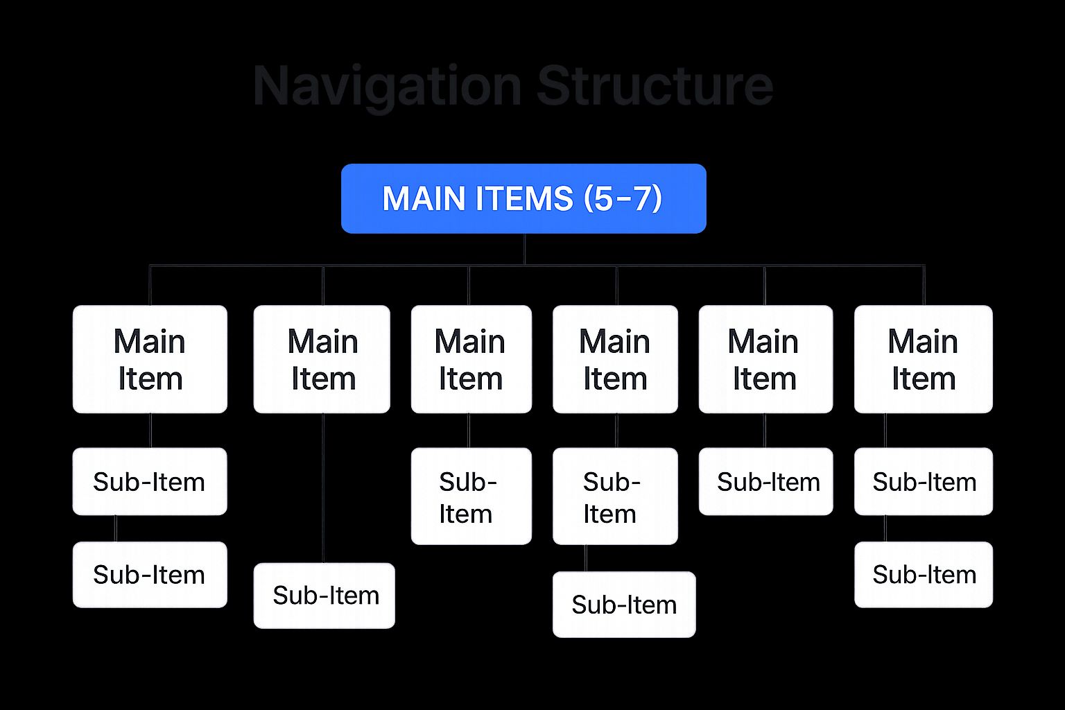
The infographic above visualizes the hierarchical structure of a simple and intuitive website navigation. At the top level, we have the main navigation categories, typically limited to 5-7 items. These categories represent the broadest groupings of content on the site. Each main category then branches out into subcategories, providing more specific options for users. Finally, individual pages reside within these subcategories, forming the lowest level of the hierarchy. This structured approach ensures that users can easily navigate from general topics to specific information. The visual representation emphasizes the importance of clear labeling and logical grouping at each level.
Key features of a simple and intuitive navigation structure include: a hierarchical organization of content; a limited number of main navigation items (typically 5-7); clear labels that accurately describe the destination content; and consistent placement of the navigation across all website pages. This approach offers several advantages: reduced cognitive load for users, meaning less mental effort is required to navigate; decreased bounce rates, as users are more likely to stay on a site they can easily navigate; improved overall user experience, fostering a positive impression of your brand; and quicker access to desired information, enhancing user satisfaction.
However, implementing this approach can present some challenges. For complex websites with extensive content, like those of large e-commerce brands, creating a simplified navigation can be difficult. It requires making tough decisions about content prioritization. Additionally, as your website grows and evolves, the navigation structure may require regular revisions to accommodate new content and features.
Examples of successful implementation abound. Apple.com, despite offering a wide range of products and services, features minimal top navigation with clear categories. Amazon.com, despite its vast inventory, utilizes clear category organization to guide users through its massive product catalog. Airbnb.com employs simple, focused navigation emphasizing core user tasks like finding accommodation and managing bookings.
To create a truly effective navigation structure, consider these actionable tips: conduct card sorting exercises with your target audience (SMEs, entrepreneurs, etc.) to determine logical content groupings; use website analytics to identify the most accessed content and prioritize it accordingly; test your navigation with real users to validate its intuitive nature; and consider implementing breadcrumbs for complex hierarchies, helping users understand their location within the site.
This principle of website navigation best practices is crucial because it directly impacts user experience and, consequently, business outcomes. By making it easy for users to find what they need, you increase engagement, conversions, and ultimately, the success of your online presence, regardless of whether you’re a Denver-based business needing a modern WordPress site or a Colorado e-commerce brand seeking local web design.
2. Responsive Navigation Design
Responsive navigation design is a crucial element of website navigation best practices. It ensures your website’s navigation adapts smoothly across various devices and screen sizes, providing a consistent and user-friendly experience whether visitors are browsing on a desktop computer, laptop, tablet, or smartphone. This approach transforms traditional, often complex, desktop menus into mobile-friendly formats like hamburger menus, bottom bars, or other condensed navigation patterns when viewed on smaller screens. This dynamic adaptation is essential for modern web experiences as it caters to the increasingly mobile user base.

Responsive navigation relies on several key features: automatic adaptation based on screen size and device, seamless transitions between expanded and collapsed states, maintaining consistent access to all navigation options regardless of the device, and preserving your brand’s visual identity across different formats. For businesses, particularly SMEs, e-commerce brands, and event organizers, this means a single website can effectively serve all users, eliminating the need for a separate mobile site and simplifying website management.
Why is responsive navigation a best practice? It offers several significant advantages:
- Optimal User Experience: Provides a consistent and easy-to-use experience across all devices, improving user satisfaction and engagement.
- Cost-Effective: Eliminates the need to develop and maintain separate mobile websites, saving time and resources.
- Improved SEO: A single URL structure for all devices benefits SEO, making it easier for search engines to crawl and index your website.
- Future-Proofing: Accommodates the growing mobile user base and ensures your website is accessible to everyone.
However, there are also potential drawbacks to consider:
- Technical Challenges: Implementing responsive navigation correctly can be technically complex, potentially requiring specialized development skills.
- Discoverability Issues: Hidden navigation elements, like hamburger menus, can sometimes reduce the discoverability of certain sections of your website.
- Thorough Testing Required: Rigorous testing across multiple devices is essential to ensure seamless functionality and optimal user experience.
Examples of Successful Implementation:
- Starbucks.com: Demonstrates a seamless transition between desktop and mobile navigation, maintaining brand consistency and user-friendliness.
- The Guardian: Showcases a thoughtful adaptation of a complex navigation hierarchy for mobile, ensuring accessibility without sacrificing functionality.
- Etsy.com: Maintains robust category access across all device sizes, catering to their diverse product offerings and user base.
Actionable Tips for Implementation:
- Mobile-First Approach: Design for mobile devices first, then expand the design for larger screens. This ensures a streamlined and efficient mobile experience.
- Real Device Testing: Test your navigation on actual devices, not just browser emulators, to identify and address real-world usability issues.
- Bottom Navigation for Mobile: Consider using bottom navigation for mobile interfaces to improve thumb accessibility and enhance one-handed usability.
- Adequate Touch Targets: Ensure touch targets are at least 44×44 pixels for mobile users to prevent accidental clicks and improve the overall tactile experience.
- Viewport Meta Tags: Implement proper viewport meta tags to control scaling and ensure your website displays correctly on different screen sizes.
Influential Figures and Frameworks:
Responsive web design, the foundation of responsive navigation, was popularized by Ethan Marcotte, who coined the term in 2010. Frameworks like Twitter Bootstrap and Luke Wroblewski’s mobile-first approach have also contributed significantly to its widespread adoption.
For businesses of all sizes, especially those targeting a mobile audience – from Denver-based SMEs and e-commerce brands to event organizers requiring booking systems – responsive navigation is no longer a luxury but a necessity. Implementing these best practices ensures your website provides a user-friendly experience, improves SEO, and ultimately contributes to the success of your online presence.
3. Clear Visual Hierarchy and Signposting
Effective website navigation is crucial for a positive user experience, and clear visual hierarchy and signposting play a vital role in achieving this. This best practice utilizes design principles to guide users’ attention to the most important navigation elements, creating clear pathways through your site and ensuring visitors can easily find what they’re looking for. This involves using visual cues like size, color, spacing, and positioning to signal the relationships between navigation elements and their relative importance within the site’s structure. A well-defined hierarchy reduces cognitive load, allowing users to intuitively understand the site’s organization and navigate effortlessly. For SMEs, entrepreneurs, and established companies alike, this translates to improved user engagement, lower bounce rates, and ultimately, better business outcomes.

A website with a strong visual hierarchy typically features distinct styling for primary, secondary, and tertiary navigation. This might involve using larger font sizes, bolder colors, or prominent placement for primary navigation items (like “About Us,” “Services,” or “Contact”). Secondary and tertiary navigation items are then visually subdued, ensuring they don’t compete for attention but remain easily accessible. Clear visual indicators of the current page location, such as highlighting or underlining the active navigation item, are essential for user orientation. Consistent hover/active states for interactive elements (buttons, links) provide immediate feedback, enhancing usability. Finally, whitespace plays a critical role in creating logical groupings within the navigation, making it easier for users to scan and comprehend the options available to them.
Examples of Successful Implementation:
- Gov.uk: Known for its exemplary clear hierarchy with minimal visual distraction, Gov.uk provides a benchmark for simple, effective navigation.
- Mailchimp.com: Mailchimp utilizes strong visual signposting with colorful, clear navigation elements, guiding users through its diverse feature set.
- Netflix.com: Netflix demonstrates a clear hierarchy between browsing categories and account functions, ensuring a smooth user experience whether you’re searching for a new show or managing your profile.
Actionable Tips for Implementation:
- Contrast: Use a color contrast of at least 4.5:1 for text navigation elements to ensure readability and accessibility.
- “You Are Here” Indicators: Implement distinct visual cues (highlighting, underlining, color change) to clearly indicate the current page location.
- Visual Separation: Create visual separation between navigation groups using whitespace, lines, or different background colors.
- Accessibility Testing: Test your navigation designs with colorblind simulation tools to ensure accessibility for all users.
- Consistency: Maintain consistent styling across the site to build user familiarity and reinforce the visual hierarchy.
Pros and Cons:
- Pros: Helps users understand site structure intuitively, reduces confusion about current location, guides users toward important actions or content, creates a sense of orientation within complex sites.
- Cons: Can be challenging to balance aesthetics with clarity, may require compromise between design vision and usability, needs careful consideration for accessibility compliance.
Why This Matters:
Clear visual hierarchy and signposting are fundamental to website navigation best practices. By implementing these principles, businesses of all sizes – from Denver-based event organizers needing booking systems to e-commerce brands on Shopify seeking better UX – can create a more user-friendly online experience. This leads to increased engagement, improved conversion rates, and a stronger online presence. These principles are popularized by usability experts like Jakob Nielsen (usability heuristics) and Steve Krug (“Don’t Make Me Think”), and are core tenets of design systems like Google’s Material Design guidelines. By prioritizing clear visual hierarchy, you empower your users to navigate your website with ease and confidence, achieving their goals and contributing to your business success.
4. Search Functionality Integration
Effective website navigation is crucial for a positive user experience. While traditional menus and hierarchical structures guide users through your site’s architecture, integrating a robust search function is a critical element of modern website navigation best practices. Search functionality supplements these traditional methods by offering a direct path to specific content, catering to users who know precisely what they’re looking for and prefer not to browse. This is especially valuable for content-heavy websites, e-commerce platforms, and businesses targeting specific user needs.
For SMEs, entrepreneurs, and established companies alike, a well-implemented search feature can significantly enhance user engagement and conversion rates. Whether you’re running a Shopify store, a custom WordPress site, or organizing events in Denver, search functionality can transform how visitors interact with your content.
How it Works:
Search functionality operates by indexing your website’s content and allowing users to query this index using keywords. When a user enters a search term, the search engine retrieves and displays relevant results, ideally prioritizing the most accurate matches.
Features of Effective Search Integration:
- Prominent Placement: The search box should be easily identifiable, typically located in the header (top-right corner is a common convention) and consistent across all pages. Use a magnifying glass icon to visually represent search.
- Auto-suggest/Autocomplete: As users type, the search box should offer suggestions based on popular searches and matching content, speeding up the search process.
- Advanced Search Options (for complex sites): For websites with a vast amount of content or complex data structures (e.g., e-commerce sites with numerous product attributes), advanced search options allowing users to filter results by category, price range, date, etc., are highly beneficial.
- Contextual and Relevant Results: Search results should clearly display the context of the match within the website, such as a short snippet of text surrounding the keywords, and be ranked by relevance to the search query.
- Search Analytics: Tracking search terms provides valuable insights into what your users are looking for. This data is crucial for improving content organization, identifying gaps in your content offering, and refining your SEO strategy.
Pros:
- Direct Access to Content: Users can quickly find what they need without navigating multiple menus.
- Caters to Different Preferences: Accommodates users who prefer direct searching over browsing.
- Essential for Content-Rich Sites: Especially valuable for e-commerce, blogs, and knowledge bases.
- Reduces Clicks to Destination: Streamlines the user journey and improves overall efficiency.
Cons:
- Maintenance and Tuning: Requires ongoing optimization to ensure accuracy and relevance.
- Potential for Frustration: Poorly implemented search can be more frustrating than helpful.
- Technical Complexity: Implementing advanced features can be challenging.
- Resource Intensive: Large sites may require significant server resources to handle search queries.
Examples of Successful Implementation:
- Amazon.com: Offers category-specific search with robust filtering options, allowing users to narrow down product searches based on various criteria.
- Google.com: The industry standard for search, showcasing predictive suggestions, instant results, and a refined user experience.
- Wikipedia.org: Handles misspellings and suggests related topics, demonstrating effective search even with imperfect input.
Actionable Tips for Implementation:
- Clear Visual Cue: Make the search box easily identifiable with a magnifying glass icon.
- Type-ahead Suggestions: Implement autocomplete based on popular searches and relevant content.
- Prioritize Relevance: Ensure search results are ranked by relevance to the user’s query.
- Filtering Options: Provide filtering capabilities for complex sites with diverse content.
- “No Results” Handling: Offer helpful suggestions and alternative search terms when no results are found.
- Analyze Search Terms: Regularly review search logs to improve content organization and address user needs.
Popularized By:
- Elasticsearch: A powerful open-source search and analytics engine.
- Algolia: A cloud-based search platform offering robust features and easy integration.
- Google’s Influence: Google’s search engine has significantly shaped user expectations regarding search functionality.
Search functionality deserves its place among website navigation best practices because it empowers users, enhances their experience, and ultimately contributes to a more effective and engaging website. By implementing these tips and considering the examples provided, businesses of all sizes, from Denver-based startups to established e-commerce brands, can leverage search to improve their website’s performance and achieve their online goals.
5. Accessibility-First Navigation Design
Accessibility-first navigation design is a critical aspect of creating a user-friendly and inclusive website. It prioritizes making your website’s navigation usable for everyone, including people with disabilities. This approach ensures your website adheres to the Web Content Accessibility Guidelines (WCAG), a set of internationally recognized standards for web accessibility. By designing with accessibility in mind from the outset, you not only cater to a wider audience but also often improve the overall user experience for everyone. This practice is an essential element of website navigation best practices.
This approach focuses on making all navigation elements easily perceivable, operable, understandable, and robust. In practice, this involves implementing features like:
- Keyboard navigability: Every interactive element within your navigation should be accessible and usable using only a keyboard. This is crucial for users who cannot use a mouse, including those with motor impairments.
- Screen reader compatibility: Assistive technologies like screen readers rely on proper ARIA (Accessible Rich Internet Applications) labels to interpret and convey the information within the navigation to users. Clear and descriptive labels are essential for these users to understand the navigation structure and purpose of each link.
- Sufficient color contrast: Ensuring adequate contrast between text and background colors in your navigation is essential for users with low vision. WCAG provides specific contrast ratios that must be met for accessibility compliance.
- Focus indicators: Visual cues, such as a change in color or the appearance of a border, are necessary to indicate which element currently has keyboard focus. This helps keyboard users track their position within the navigation.
- Skip navigation links: These links, often placed at the very beginning of the page, allow screen reader users to quickly bypass repetitive navigation elements and jump directly to the main content. This significantly improves the browsing experience for these users.
Why prioritize accessibility-first navigation?
Beyond the ethical imperative of inclusivity, there are strong business reasons for implementing accessibility-first navigation:
- Expanded reach: Making your website accessible opens your doors to a larger potential customer base, including people with disabilities.
- Improved usability: Many accessibility features, such as clear keyboard navigation and well-defined focus indicators, benefit all users, not just those with disabilities.
- Legal compliance: Depending on your location and target audience, complying with accessibility guidelines like the Americans with Disabilities Act (ADA) and Section 508 may be a legal requirement. Accessibility lawsuits are increasingly common, and building an accessible website from the start can mitigate this risk.
- Enhanced brand image: Prioritizing accessibility demonstrates your commitment to inclusivity and social responsibility, potentially improving your brand’s reputation and attracting customers who value these principles.
Pros and Cons of Accessibility-First Navigation:
Pros:
- Makes website usable for people with disabilities.
- Often improves usability for all users.
- Helps comply with legal requirements (ADA, Section 508, etc.).
- Demonstrates brand’s commitment to inclusion.
Cons:
- May require additional development time.
- Can introduce design constraints.
- Requires specialized knowledge to implement correctly.
- Needs ongoing testing with assistive technologies.
Examples of Successful Implementation:
- Gov.uk: Provides an exemplary example of accessibility implementation throughout its navigation and the entire website.
- BBC.co.uk: Offers comprehensive keyboard accessibility and robust screen reader support.
- Target.com: Features robust accessible navigation implemented following an ADA lawsuit resolution.
Actionable Tips for SMEs and Businesses:
- Add “skip to main content” links for keyboard and screen reader users.
- Test navigation with keyboard-only (no mouse) to verify accessibility.
- Use semantic HTML elements (
<nav>,<ul>,<li>) for navigation structure. - Implement proper ARIA roles, states, and properties to enhance accessibility for assistive technologies.
- Ensure hover states also have equivalent focus states for keyboard users.
- Verify that dropdown menus can be operated using the keyboard alone.
Popularized By:
- W3C Web Accessibility Initiative (WAI)
- Web Content Accessibility Guidelines (WCAG)
- Disability rights advocates and organizations
By incorporating these tips and examples into your web design process, you can ensure your website navigation is accessible to everyone and exemplifies website navigation best practices. This not only broadens your reach but also builds a more inclusive and user-friendly online experience.
6. Contextual and Adaptive Navigation
Contextual and adaptive navigation represents a significant advancement in website navigation best practices, moving beyond static menus to create a more personalized and efficient user experience. Instead of presenting every user with the same navigation options, this approach tailors the navigation based on various factors like user behavior, their location within the site, their past browsing history, or even their declared preferences. This dynamic approach simplifies navigation by highlighting the options most likely to be relevant at any given moment. For SMEs, entrepreneurs, and established companies alike, contextual navigation can be a powerful tool to enhance user engagement and drive conversions.
How it Works:
Contextual navigation relies on gathering and interpreting user data to predict their needs and intentions. This data can be collected through various means, including tracking browsing history, analyzing clickstream data, and integrating with user accounts. The system then uses this data to dynamically adjust the navigation elements, presenting different options or prioritizing specific links. For instance, an e-commerce site might suggest related products based on items previously viewed, or a blog might highlight articles related to the user’s current reading material.
Features of Contextual and Adaptive Navigation:
- Dynamic Menu Options: Menus can change based on the user’s current section of the website.
- Personalized Navigation: Navigation options adapt to user history and preferences, showing items they are more likely to interact with.
- Predictive Navigation Suggestions: The system anticipates user needs, offering shortcuts to anticipated destinations.
- Breadcrumbs: These navigational aids provide context and allow users to easily backtrack through their journey on the site.
- Related Content Links: Supplementary navigation links guide users to related information, enhancing engagement and discovery.
Benefits for Your Business:
- Creates More Efficient User Journeys: Streamlined navigation gets users to their desired destination faster, improving overall satisfaction. This is particularly important for e-commerce brands on platforms like Shopify or WooCommerce aiming for better UX and sales.
- Reduces Cognitive Load: By showing only the most relevant options, contextual navigation simplifies decision-making and reduces user frustration, particularly helpful for complex websites.
- Can Increase Conversion Rates: Strategic pathways lead users towards desired actions, boosting conversions and achieving business goals. This is a crucial advantage for Denver-based businesses needing modern WordPress or Shopify websites focused on lead generation or sales.
- Makes Complex Sites More Manageable: For medium-sized businesses with extensive product catalogs or content libraries, contextual navigation makes the site easier to browse and explore.
Pros and Cons:
- Pros: Efficient user journeys, reduced cognitive load, increased conversion rates, manageable complex sites.
- Cons: Potential user confusion if changes are too abrupt, sophisticated implementation requirements, reliance on accurate user data, potential privacy concerns.
Examples of Successful Implementation:
- Netflix.com: Navigation adapts based on viewing history and preferences, suggesting relevant movies and shows.
- Amazon.com: The “Related to items you’ve viewed” section acts as contextual navigation, guiding users to similar products.
- Spotify: Dynamic navigation surfaces personalized music recommendations based on listening habits and content discovery.
Actionable Tips for Implementation:
- Maintain Core Navigation Consistency: Ensure that core navigation elements remain predictable and accessible despite contextual changes.
- Gradual Adaptation: Implement subtle navigation shifts rather than sudden, jarring changes.
- Transparency: Clearly indicate to users why they are seeing specific navigation options. For example, a label like “Recommended for you based on your viewing history” fosters trust and understanding.
- Opt-Out Option: Provide users with the ability to opt out of personalized navigation if they prefer.
- User Testing: Conduct thorough user testing to verify the effectiveness of your contextual navigation and identify any areas for improvement.
Why Contextual and Adaptive Navigation Deserves Its Place on the List:
In today’s competitive digital landscape, providing a superior user experience is paramount. Contextual and adaptive navigation is no longer a luxury but a necessity for businesses aiming to optimize their online presence. It’s a crucial element of website navigation best practices, particularly for Colorado e-commerce brands and Denver businesses seeking to enhance user engagement and drive business growth. By understanding and implementing these techniques, businesses can create more intuitive and personalized experiences, leading to increased customer satisfaction and ultimately, greater success.
7. Performance-Optimized Navigation
In today’s fast-paced digital world, users expect websites to load quickly and be responsive. Slow-loading websites lead to frustration and high bounce rates, impacting both user experience and your bottom line. This is especially true for website navigation, which is the user’s primary tool for exploring your site. Performance-optimized navigation, our seventh best practice, addresses this by prioritizing speed and efficiency, ensuring your users can easily find what they need without unnecessary delays. This is crucial for all businesses, but particularly vital for SMEs, e-commerce brands, and any business relying on online visibility, including those based in Denver and Colorado looking to attract local customers.
Performance-optimized navigation focuses on making navigation elements load quickly and function smoothly, particularly on mobile devices or low-bandwidth connections. This recognizes that navigation usability is directly impacted by performance, and even the best-designed navigation fails if it’s slow or unresponsive. For Denver event organizers with ticketing systems integrated into their websites, or e-commerce businesses on Shopify or WooCommerce, this fast and responsive navigation is paramount for converting visitors into attendees or customers.
How it Works:
This approach leverages several key features:
- Lightweight code implementation: Minimizing the size and complexity of the navigation code.
- Minimal dependency on heavy JavaScript frameworks: Reducing reliance on large JavaScript libraries that can slow down page load times.
- Efficient loading of navigation elements: Optimizing image formats and using techniques like lazy loading for images within the navigation.
- Server-side rendering for critical navigation paths: Rendering essential navigation elements on the server to speed up initial page load.
- Progressive enhancement approach: Building core navigation functionality with basic HTML and CSS, then enhancing it with JavaScript for richer interactions where appropriate.
Examples of Successful Implementation:
- GitHub.com: Handles complex navigation with impressive speed and responsiveness.
- Wikipedia.org: Demonstrates how a minimalist, performance-focused navigation design can be highly effective.
- The Guardian: Uses a progressive enhancement approach, ensuring basic navigation functionality is available even without JavaScript.
Actionable Tips for Implementation:
- Minimize or defer JavaScript for non-critical navigation functions: Prioritize functionality over flashy effects.
- Implement CSS transitions instead of JavaScript animations where possible: CSS transitions are generally more performant.
- Consider using static HTML for core navigation with JavaScript enhancements: This ensures a fast initial load.
- Test navigation performance on low-end devices and slow connections: Emulate real-world conditions. Tools like Google PageSpeed Insights and GTmetrix are invaluable for this.
- Use code splitting to load navigation components only when needed: This prevents loading unnecessary code.
- Implement critical CSS for navigation elements: Prioritize loading the CSS necessary for rendering the navigation above the fold.
Pros:
- Improved user experience, especially on mobile or slow connections: Happy users are more likely to convert.
- Reduces bounce rates caused by slow-loading navigation: Keep users engaged and exploring your site.
- Contributes to better SEO (speed is a ranking factor): Higher rankings mean more visibility.
- Creates a more inclusive experience for users worldwide: Reaches a wider audience, regardless of their internet connection.
Cons:
- May limit animation or interactive features: Balancing performance and design can be challenging.
- Requires additional development expertise: Implementing these techniques may require specialized knowledge.
- Needs ongoing performance monitoring: Regularly check and optimize navigation performance.
- May create tension between design ambitions and performance realities: Finding the right balance is key.
Why Performance-Optimized Navigation Deserves its Place in the List:
Website navigation best practices must include performance optimization. In the competitive online landscape, speed and responsiveness are essential for user satisfaction and business success. For SMEs and entrepreneurs seeking tailored web solutions, this translates to a better user experience and increased conversions. For established companies and e-commerce brands, performance-optimized navigation strengthens their brand image and contributes to achieving digital growth goals. By adhering to the principles of performance-optimized navigation, businesses of all sizes can ensure their websites provide a seamless and enjoyable experience for every visitor. This is particularly pertinent for businesses in Denver and Colorado striving to make a mark in their local market.
8. Data-Driven Navigation Optimization
In the pursuit of website navigation best practices, data-driven optimization stands out as a crucial strategy for creating user-centered experiences. This approach leverages analytics, user testing, and behavioral data to continuously refine your website’s navigation structure. Instead of relying on assumptions, data-driven navigation treats your website’s navigation as an evolving system that improves based on real user behavior, ensuring it effectively supports both user needs and your business goals. This is particularly important for SMEs, entrepreneurs, established companies, e-commerce brands, and event organizers who need their websites to perform optimally and drive conversions.
How it Works:
Data-driven navigation optimization involves a continuous cycle of observation, analysis, and refinement. By implementing various analytical tools and techniques, you gather insights into how users interact with your navigation. These insights then inform iterative changes designed to improve user experience and achieve business objectives.
Features of Data-Driven Navigation Optimization:
- Implementation of Navigation Analytics Tracking: Tools like Google Analytics allow you to track key metrics such as click-through rates, bounce rates, and time spent on page, specifically related to navigation elements.
- A/B Testing of Navigation Variations: Experiment with different navigation structures, labels, and placements to identify which variations perform best.
- Heat Mapping of Navigation Interaction: Visual representations like heatmaps show where users click and hover on your navigation, highlighting areas of interest and potential usability issues. Tools like Hotjar are popular for this.
- User Session Recordings Analysis: Observing recordings of real user sessions provides qualitative insights into how users navigate your site, revealing pain points and areas for improvement.
- Regular Navigation Audit Cycles: Establish a regular schedule for reviewing navigation performance metrics and identifying areas for optimization.
Pros:
- Creates Navigation Based on Actual User Behavior: Eliminates guesswork and ensures your navigation aligns with how users actually interact with your website.
- Identifies and Resolves Navigation Pain Points: Uncovers usability issues and allows you to address them directly, improving user experience and satisfaction.
- Allows for Continuous Improvement: Promotes an iterative approach to navigation design, rather than relying on infrequent and potentially disruptive redesigns.
- Can Significantly Improve Conversion Rates and User Satisfaction: By making it easier for users to find what they’re looking for, you can increase conversions and foster loyalty.
Cons:
- Requires Substantial Analytical Expertise: Interpreting data and making informed decisions requires a certain level of analytical skill.
- May Introduce Temporary Inconsistencies During Testing: A/B testing can create temporary variations in navigation, which might slightly confuse returning users.
- Needs Ongoing Resource Commitment: Data analysis and ongoing testing require dedicated time and resources.
- Can be Challenging to Balance Data Insights with Design Principles: While data is crucial, it’s important to balance data-driven insights with established design principles for aesthetics and usability.
Examples of Successful Implementation:
- Booking.com: Known for rigorous A/B testing of its navigation elements to optimize for conversions.
- HubSpot: Has documented data-informed navigation improvements in various case studies.
- Slack: Continuously evolves its navigation based on observed usage patterns.
Actionable Tips for SMEs and other Businesses:
- Set up dedicated navigation tracking in analytics platforms (e.g., Google Analytics event tracking). Track clicks, hover time, and other interactions with navigation elements.
- Implement click/tap heat mapping for main navigation elements. Visualize user interaction patterns to identify areas of high engagement and potential usability problems.
- Create a regular cadence for navigation performance review (e.g., monthly or quarterly). Regularly analyze data to identify trends and areas for improvement.
- Test small navigation changes frequently rather than occasional major overhauls. Iterative changes minimize disruption and allow for more controlled testing.
- Supplement quantitative data with qualitative user feedback. Gather user feedback through surveys, user testing, or other methods to gain a deeper understanding of user needs and preferences.
- Document baseline metrics before making changes to measure impact. Tracking before-and-after performance helps you assess the effectiveness of your optimization efforts.
Why Data-Driven Navigation Optimization Deserves Its Place on the List:
In today’s competitive digital landscape, a well-optimized website navigation is essential for success. Data-driven optimization provides a systematic and effective way to ensure your navigation is serving both your users and your business objectives. By leveraging data insights, you can create a navigation experience that is intuitive, efficient, and ultimately drives conversions. This is especially valuable for businesses targeting specific demographics or industries, like Denver-based companies or Colorado e-commerce brands, where understanding local user behavior can significantly impact website performance. By adopting a data-driven approach, you transition from guesswork to informed decision-making, ensuring your website navigation is a strength rather than a weakness.
Top 8 Website Navigation Best Practices Comparison
| Practice | Implementation Complexity 🔄 | Resource Requirements 💡 | Expected Outcomes 📊 | Ideal Use Cases 💡 | Key Advantages ⭐ |
|---|---|---|---|---|---|
| Simple and Intuitive Navigation | Low to Medium | Moderate (content prioritization) | Clear, easy navigation; reduced bounce rates | Small to medium sites, straightforward content | Reduces cognitive load; improves findability; UX boost |
| Responsive Navigation Design | Medium to High | High (cross-device testing/dev) | Seamless multi-device experience; better SEO | Sites with diverse device users | Adapts to all screen sizes; eliminates separate mobile sites |
| Clear Visual Hierarchy & Signposting | Medium | Moderate (design & accessibility) | Improved orientation; reduces user confusion | Complex sites needing clarity in navigation | Guides attention effectively; supports accessibility |
| Search Functionality Integration | High | High (development, tuning) | Direct content access; reduces clicks | Content-rich/ecommerce sites | Offers precise navigation alternative; accommodates diverse prefs |
| Accessibility-First Navigation | Medium to High | Moderate to High (specialized skills) | Inclusive navigation; legal compliance | Any site aiming for wide usability | Ensures usability for all; meets legal standards |
| Contextual and Adaptive Navigation | High | High (data, personalization tech) | Personalized navigation; increased conversions | Large, user-centric platforms | Reduces cognitive load; makes complex sites manageable |
| Performance-Optimized Navigation | Medium | Moderate (performance testing) | Fast, responsive navigation; better SEO | Mobile-focused, low-bandwidth environments | Enhances speed and responsiveness; reduces bounce rates |
| Data-Driven Navigation Optimization | High | High (analytics, testing teams) | Continuous improvements; data-backed decisions | Sites focused on conversion and UX optimization | Identifies pain points; supports iterative improvement |
Charting a Course for Conversion
Mastering website navigation best practices is crucial for online success. From implementing a simple and intuitive navigation structure to leveraging data-driven optimization, each element discussed in this article plays a vital role in shaping a positive user experience. The key takeaways to remember are prioritizing accessibility, ensuring responsiveness, and maintaining a clear visual hierarchy. By focusing on these core aspects, you can significantly improve user engagement, reduce bounce rates, and ultimately, drive conversions. Effective website navigation isn’t just about getting visitors from point A to point B; it’s about guiding them seamlessly through their journey, encouraging exploration, and ultimately, achieving their goals – and yours.
By implementing these website navigation best practices, you’re not just creating a more user-friendly website – you’re building a high-performing digital asset primed for conversions and continued growth. Remember, at Denver Web Design Studio, we specialize in transforming businesses through exceptional web design and digital marketing strategies. We’re passionate about crafting online experiences that captivate audiences, elevate brands, and drive measurable results.
Ready to elevate your website navigation to the next level and transform your online presence? Denver Web Design Studio specializes in creating intuitive and effective navigation solutions tailored to your business needs. Contact us today to get started!